Typography That Sells: Best Fonts for POD T-Shirts and Mugs.
Discover the best fonts for POD T-Shirts and mugs that boost sales. Learn how to pair fonts effectively, avoid common mistakes, and create designs that stand out.
Introduction: Best Fonts for POD T-Shirts and Mugs
Are you struggling to make your print-on-demand designs stand out? When I first started selling custom t-shirts, I used a generic script font for all my designs—thinking it looked “creative.” Unfortunately, the text was hard to read, and my sales were lackluster. Once I switched to a clean sans-serif font paired with bold accents, my conversion rates skyrocketed. In this guide, we’ll explore the best fonts for POD t-shirts and mugs , how to pair them effectively, and advanced strategies to elevate your typography game. Let’s dive in!
Types of Fonts and Their Impact
Choosing the right type of font can make or break your design. Here’s a breakdown of the most common font categories and their impact:
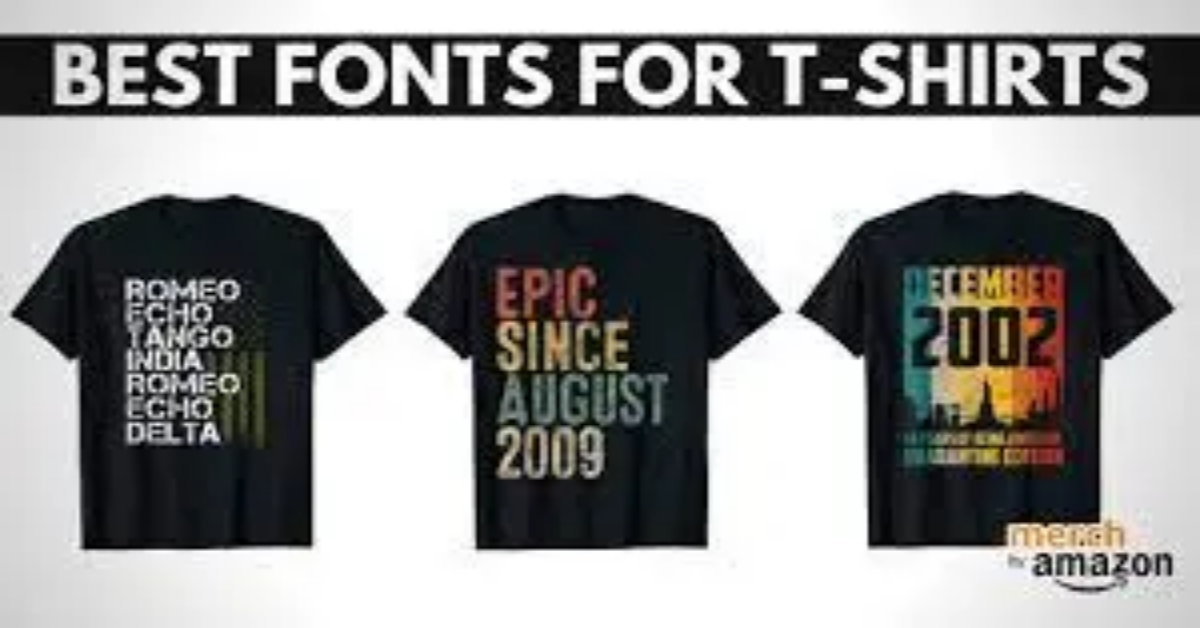
- Sans-Serif Fonts : Clean, modern, and highly legible, these fonts are perfect for minimalist and professional designs. Examples include Helvetica , Arial , and Roboto .
- Use Case: Tech-themed products, corporate branding, or modern apparel.
- Serif Fonts : Elegant and timeless, serif fonts convey sophistication and tradition. Examples include Times New Roman , Georgia , and Playfair Display .
- Use Case: Vintage-inspired designs, formal invitations, or literary-themed products.
- Script Fonts : Creative and artistic, script fonts mimic handwriting and add a personal touch. Examples include Pacifico , Lobster , and Dancing Script .
- Use Case: Handwritten quotes, wedding-themed products, or playful designs.
For instance, I used a serif font for a vintage poster design and paired it with a sans-serif font for contrast. The result? A visually appealing product that resonated with buyers.
How to Pair Fonts for Maximum Appeal
Pairing fonts effectively is key to creating balanced and visually appealing designs. Here’s how to do it:
- Contrast is Key : Combine fonts with different styles (e.g., sans-serif with serif) to create visual interest. Avoid pairing two fonts that are too similar.
- Hierarchy Matters : Use one font for headlines and another for body text to establish a clear hierarchy. For example, use a bold script font for the main message and a clean sans-serif font for supporting text.
- Limit Your Palette : Stick to 2–3 fonts per design to avoid clutter.
Tools like Fontjoy , Canva , and Google Fonts can help you test font combinations. For example, I used Font Joy to pair Montserrat (sans-serif) with Merriweather (serif), which worked beautifully for a motivational mug design.
Best Fonts for Different Niches
Different niches require different fonts to resonate with their target audience. Here’s a breakdown:
- Gaming : Bold, futuristic fonts like Orbitron or Bebas Neue work well for gaming-themed products. These fonts convey excitement and intensity.
- Example: A gaming brand I collaborated with used Bebas Neue for a controller-themed t-shirt, which became a best-seller.
- Wellness : Soft, rounded fonts like Quicksand or Nunito evoke calmness and relaxation. These fonts are perfect for yoga mats, meditation journals, or wellness-themed apparel.
- Example: A mindfulness poster I designed featured Quicksand , which resonated deeply with stressed-out professionals.
- Pets : Playful, handwritten fonts like Fredoka One or Amatic SC appeal to pet owners. These fonts convey warmth, joy, and playfulness.
- Example: A pet-themed mug I created used Fredoka One for paw-print text, which stood out in crowded marketplaces.
- Kids : Fun, colorful fonts like Comic Sans or Luckiest Guy are ideal for children’s products. These fonts are energetic and eye-catching.
Common Mistakes to Avoid in Typography
Typography mistakes can hurt your sales and alienate buyers. Here are some common pitfalls to avoid:
- Using Too Many Fonts : Overloading your design with multiple fonts can make it look chaotic. Stick to 2–3 fonts for clarity and cohesion.
- Choosing Illegible Fonts for Small Prints : Fancy script fonts may look great on a computer screen but become unreadable when printed on small products like mugs. Always test readability at different sizes.
- Ignoring Alignment and Spacing : Poor alignment and spacing can make your design look unprofessional. Use tools like Canva or Photoshop to adjust kerning and line height.
For example, I once used a decorative font for a mug design, only to realize it was illegible when printed. Learning from this mistake, I now prioritize readability over aesthetics.
Advanced Strategies for Typography
Take your typography game to the next level with these advanced strategies:
- Customizing Fonts : Modify existing fonts to make them unique. For example, add textures, shadows, or gradients to create a custom look.
- Adding Effects : Experiment with effects like outlines, embossing, or 3D text to make your fonts stand out.
- Testing Variations : Create multiple versions of your design with different fonts and gather feedback from your audience.
For instance, I added a subtle gradient effect to a bold sans-serif font for a motivational t-shirt design, which boosted engagement significantly.
Conclusion: Best Fonts for POD T-Shirts and Mugs
Typography plays a crucial role in the success of your best fonts for print-on-demand t-shirts and mugs. By choosing the right fonts, pairing them effectively, and avoiding common mistakes, you can create designs that resonate with buyers and drive sales. Remember, testing and refining your approach is key to long-term success.
Ready to experiment with typography in your POD designs? Share your favorite font combinations in the comments below. Let’s grow together!
FAQs: Best Fonts for POD T-Shirts and Mugs
Q1: What are the best free fonts for POD designs?
Some of the best free fonts include Montserrat , Open Sans , Lobster , and Pacifico . These fonts are versatile, legible, and widely available on platforms like Google Fonts.
Q2: How do I make sure my fonts look good on mugs?
Test your fonts at different sizes to ensure readability. Avoid overly thin or decorative fonts, as they may not print well on curved surfaces.
Q3: Can I use copyrighted fonts for POD?
No, using copyrighted fonts without permission can lead to legal issues. Always check the licensing terms or use royalty-free fonts for commercial projects.
Q4: How do I choose the right font size for t-shirts?
The ideal font size depends on the design and placement. For chest prints, use 2–4 inches tall text. For back prints, go larger (6–8 inches).
Q5: Are handwritten fonts trendy in POD design?
Yes, handwritten fonts are popular for personalized and playful designs. However, ensure they’re legible and align with your product’s theme.