The Psychology of Colors in POD Product Design | Boost Conversions with Strategic Color Choices
Discover how the psychology of colors in print-on-demand design can boost conversions. Learn to choose the right colors for your niche and avoid common mistakes that hurt sales.
Introduction: Psychology of Colors in POD Product Design
Are you aware that the colors you choose for your print-on-demand products can make or break a sale? When I first started designing custom t-shirts, I made the mistake of using red—a color associated with urgency—for a calming meditation-themed design. Unsurprisingly, my sales tanked. Once I switched to soft blues and greens, which evoke calmness and trust, my conversion rates soared. In this guide, we’ll explore the psychology of colors in POD product design and how you can use it to boost conversions. Let’s dive in!
Understanding the Basics of Color Psychology
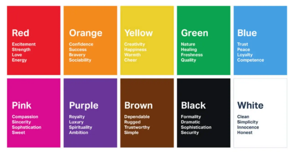
Color psychology is the study of how colors influence human emotions, behaviors, and decision-making. In print-on-demand design, choosing the right colors can evoke specific feelings in your audience, ultimately driving them to purchase. Here’s a breakdown of common colors and their psychological effects:
- Red : Associated with urgency, excitement, and passion. It’s great for clearance sales or products targeting impulse buyers.
- Blue : Evokes trust, calmness, and professionalism. Ideal for wellness, tech, and corporate-themed designs.
- Green : Symbolizes nature, health, and eco-friendliness. Perfect for sustainable or outdoor-themed products.
- Yellow : Represents optimism, energy, and happiness. Use sparingly to highlight key elements without overwhelming buyers.
- Black : Conveys sophistication, luxury, and elegance. Great for minimalist or premium designs.
- White : Represents simplicity, purity, and cleanliness. Often used as a base color for minimalist designs.
For example, when I designed a line of eco-friendly tote bags, I used green and earthy tones to align with the product’s sustainability message. Customers immediately connected with the design, leading to higher engagement and sales.
How to Choose Colors Based on Your Niche
Different niches resonate with different colors. Here’s how to choose the best colors for your target audience:
- Gaming : Gamers are drawn to bold, vibrant colors like red, black, and neon green. These colors convey excitement and intensity, perfect for gaming-themed apparel or accessories.
- Example: A gaming brand I worked with used neon green and black for a futuristic headset design, which became a best-seller.
- Wellness : Soft blues, greens, and pastels evoke calmness and relaxation. These colors work well for yoga mats, meditation journals, or wellness-themed apparel.
- Example: A wellness brand I collaborated with used light blue and lavender for a mindfulness poster, appealing to stressed-out professionals.
- Pets : Bright yellows, oranges, and playful pastels resonate with pet owners. These colors convey warmth, joy, and playfulness.
- Example: A pet-themed mug I designed featured bright yellow paw prints, which stood out in crowded marketplaces.
- Kids : Primary colors like red, blue, and yellow appeal to children and parents alike. These colors are fun, energetic, and eye-catching.
To test color combinations, use tools like Colors , Adobe Color , or Paletton . These platforms allow you to create cohesive palettes and preview how colors interact with each other.
Case Studies: Successful Use of Color Psychology in POD
Let’s look at two real-world examples of brands that successfully leveraged color psychology in their POD designs:
- Case Study 1: Pastel Colors for Baby Products
A baby-themed POD store used soft pastel colors like pink, mint green, and baby blue for their onesies and blankets. These colors evoked feelings of innocence, tenderness, and safety, resonating deeply with new parents. As a result, the store saw a 40% increase in repeat customers. - Case Study 2: Bold Colors for Fitness Motivation
A fitness brand used bold reds and blacks for their motivational posters and gym gear. These colors conveyed strength, determination, and energy, appealing to fitness enthusiasts. The brand reported a 60% increase in sales after redesigning their products with these colors.
These examples show how strategic color choices can transform your POD business.
Common Mistakes to Avoid When Using Colors
While colors can boost conversions, misuse can hurt your sales. Here are some common mistakes to avoid:
- Overusing Bright Colors : Too many bright colors can overwhelm buyers and make your design feel chaotic. Stick to a cohesive palette.
- Ignoring Cultural Differences : Colors have different meanings across cultures. For example, white symbolizes purity in Western cultures but mourning in some Eastern cultures. Research your target audience’s cultural preferences.
- Mismatching Colors and Themes : Using cheerful yellows for a serious, professional design can confuse buyers. Always align colors with your product’s theme and purpose.
For instance, I once used neon green for a formal invitation design, which alienated potential buyers. Learning from this mistake, I now carefully match colors to the product’s intent.
Pro Tips for Using Colors Effectively
Here are some actionable tips to maximize the impact of colors in your POD designs:
- Stick to 1–3 Colors Per Design : Limiting your palette ensures clarity and cohesion.
- Use Gradients Sparingly : Gradients can add modern appeal but should be used subtly to avoid distracting buyers.
- Test Variations : Create multiple versions of your design with different colors and gather feedback from your audience.
- Leverage Contrast : Use contrasting colors to highlight key elements like text or logos.
For example, I tested a minimalist t-shirt design with both monochrome and gradient variations. The monochrome version performed better, proving the power of simplicity.
Conclusion: Psychology of Colors in POD Product Design
The psychology of colors in POD product design is a powerful tool for boosting conversions. By understanding how colors influence emotions, choosing the right palette for your niche, and avoiding common mistakes, you can create designs that resonate with buyers and drive sales. Remember, success doesn’t happen overnight—experiment, gather feedback, and refine your approach.
Ready to start using color psychology in your POD designs? Share your favorite color combinations in the comments below. Let’s grow together!
FAQs: Psychology of Colors in POD Product Design
Q1: What are the best colors for eco-friendly POD products?
Soft greens, earthy browns, and muted blues are ideal for eco-friendly products. These colors evoke nature, sustainability, and calmness.
Q2: How do I test which colors work best for my audience?
Use tools like Coolors or Adobe Color to create palettes. Then, run A/B tests on your designs to see which colors resonate most with your audience.
Q3: Can I use black and white for minimalist designs?
Absolutely! Black and white are timeless and versatile, making them perfect for minimalist designs. Add subtle accents (e.g., gold or gray) for extra appeal.
Q4: Are gradients still trendy in POD design?
Yes, but use them sparingly. Subtle gradients can add depth and modernity to your designs without overwhelming buyers.
Q5: How do I avoid clashing colors in my designs?
Use complementary colors from the color wheel (e.g., blue and orange) or stick to analogous colors (e.g., blue and green) for harmony.