
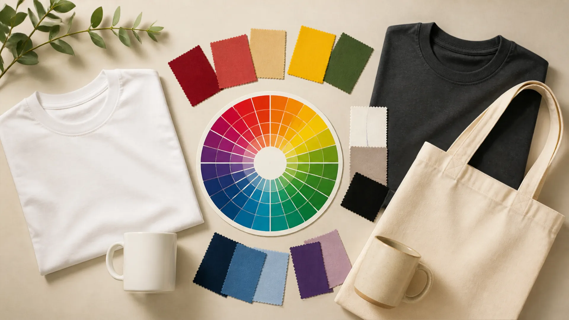
Discover how the Psychology of Colors in POD Product Design can boost conversions. Learn to choose the right colors for your niche and avoid common mistakes that hurt sales.
Introduction: Psychology of Colors in POD Product Design
Choosing the right colors can transform an ordinary print-on-demand design into a product that attracts attention and communicates a clear message. Whether you sell custom T-shirts, coffee mugs, tote bags, phone cases or wall art, color influences how customers perceive your designs and your brand.
The psychology of colors in POD product design helps sellers understand how colors communicate emotions, create visual identities and influence purchasing decisions. A carefully selected palette can make a design look playful, elegant, modern, calming or energetic.
However, there is no single color that guarantees more sales. The best choice depends on your target audience, product type, niche, design style and cultural context.
In this complete guide, you will learn the meaning of different colors, how to choose palettes for popular print-on-demand niches, which combinations work well on different products, and how to prepare your designs for professional printing..


As high-definition mobile screens become the primary shopping interface, trending palettes like ‘Electric Pastels’ and ‘Bio-morphic Earth Tones’ are dominating the print-on-demand market. Understanding how specific POD design colors trigger emotional responses—such as the calming effect of Sage Green or the high-energy urgency of Cyber-Lime—is a proven way to boost your conversion rates. When planning your next collection, consider how these 2026 Psychology of Colors in POD Product Design trends can make your listings pop against both white and dark mode backgrounds, ensuring your brand stands out in a crowded marketplace.”
What Is Color Psychology in Print-on-Demand?
Color psychology is the study of how people perceive and respond to colors. In marketing and product design, colors help communicate brand personality, create visual associations and influence how a product is perceived.
In print-on-demand (POD), color choices matter in two important ways:
1. Design colors: These are the colors used in your artwork, typography, illustrations and graphics.
2. Product colors: These are the available garment, mug, tote bag or other product colors on which your design is printed.
Both affect the final appearance of your product.
For example, a minimalist white design on a black T-shirt creates a different impression from the same design printed on a pastel pink T-shirt. Similarly, earthy green and brown graphics may complement an eco-inspired tote bag.
The objective is to create a visual combination that matches the product’s purpose and appeals to the intended customer.
Understanding the Meaning of Different Colors
Before selecting colors for your POD products, understand the common associations people have with them. These associations are not universal rules, but they provide a useful starting point.
1. Red – Energy, Passion and Excitement
Red is a bold and attention-grabbing color commonly associated with energy, passion, confidence and excitement.
Best suited for:
- Fitness and motivational T-shirts
- Sports merchandise
- Gaming accessories
- Bold statement designs
- Celebration and Valentine’s Day products
Design tip: Combine red with black for a powerful appearance or white for a clean, high-contrast design. Avoid using too much intense red in designs intended to communicate calmness.
2. Blue – Trust, Calmness and Reliability
Blue is frequently associated with trust, stability, professionalism and calmness. It is widely used in corporate branding and technology-related designs.
Best suited for:
- Technology-themed merchandise
- Travel and adventure products
- Professional gifts
- Minimalist T-shirts
- Educational and inspirational designs
Design tip: Navy blue paired with white creates a classic combination. Light blue with soft grey can produce a relaxed, modern appearance.
3. Green – Nature, Growth and Sustainability
Green is strongly associated with nature, freshness, growth and environmental awareness.
Best suited for:
- Eco-friendly merchandise
- Gardening products
- Outdoor and camping T-shirts
- Botanical illustrations
- Nature-inspired tote bags
Design tip: Combine sage green with beige, cream or warm brown for an earthy aesthetic. Dark green with white can create a sophisticated appearance.
4. Yellow – Happiness, Optimism and Creativity
Yellow communicates warmth, positivity, optimism and playfulness. It can help important design elements stand out.
Best suited for:
- Summer merchandise
- Children’s products
- Travel designs
- Inspirational graphics
- Fun novelty mugs
Design tip: Yellow works well with navy blue, black and dark grey. Always check text contrast, particularly when using light yellow backgrounds.
5. Black – Elegance, Strength and Sophistication
Black is a versatile choice for premium-looking, minimalist and modern designs. It creates strong contrast with many lighter colors.
Best suited for:
- Minimalist apparel
- Luxury-inspired merchandise
- Typography-based T-shirts
- Modern accessories
- Professional gifts
Design tip: Pair black with white, gold, beige or muted grey. Make sure dark artwork is not placed on a dark product without sufficient contrast.
6. White – Simplicity, Cleanliness and Minimalism
White is often associated with simplicity, clarity and cleanliness. It provides an effective background for colorful artwork and typography.
Best suited for:
- Minimalist T-shirts
- Typography designs
- Modern home decor
- Simple illustrations
- Clean, professional merchandise
Design tip: Use dark typography or colorful graphics to maintain readability on white products.
7. Pink – Warmth, Affection and Playfulness
Pink can communicate affection, softness, creativity and playfulness. Its appearance varies considerably depending on the shade.
Best suited for:
- Baby and nursery products
- Mother’s Day gifts
- Cute animal illustrations
- Personalized gifts
- Lifestyle merchandise
Design tip: Blush pink paired with cream creates a gentle appearance, while hot pink with black produces a bold and energetic look.
8. Purple – Creativity, Imagination and Luxury
Purple is commonly associated with creativity, imagination, individuality and luxury.
Best suited for:
- Artistic merchandise
- Fantasy-themed designs
- Creative journals
- Inspirational products
- Premium-looking accessories
Design tip: Combine lavender with white for a soft aesthetic or deep purple with gold for a more dramatic appearance.
9. Orange – Enthusiasm, Warmth and Friendliness
Orange is an energetic and welcoming color that can make designs feel approachable and lively.
Best suited for:
- Outdoor merchandise
- Summer T-shirts
- Sports products
- Food-related designs
- Fun novelty gifts
Design tip: Orange works particularly well with navy blue, cream and charcoal.
10. Brown and Beige – Warmth, Naturalness and Simplicity
Brown and beige are useful for vintage, rustic, minimalist and nature-inspired designs.
Best suited for:
- Coffee-themed mugs
- Farmhouse wall art
- Eco-inspired merchandise
- Rustic typography
- Neutral lifestyle products
Design tip: Combine warm beige with chocolate brown, muted green or cream for a cohesive look.
How to Choose Colors Based on Your Niche
Your niche should influence your color selection. A palette that works for gaming merchandise may not be suitable for baby gifts or wellness products.
Here are practical starting points for popular POD niches.
1. Fitness and Gym Merchandise
Fitness customers often respond to designs that communicate motivation, energy and strength.
Suggested palette:
- Black: #111111
- Red: #E53935
- White: #FFFFFF
- Charcoal: #333333
Use bold typography, simple graphics and strong contrast for motivational apparel and gym accessories.
2. Baby and Nursery Products
Baby-related products often use soft, gentle palettes that create a welcoming appearance.
Suggested palette:
- Blush pink: #F4C2C2
- Baby blue: #A7C7E7
- Mint green: #B8E0D2
- Cream: #FFF1DC
These colors work well for baby blankets, nursery prints, onesies and personalized gifts.
3. Eco-Friendly and Nature-Inspired Products
Nature-inspired designs benefit from earthy colors and organic-looking combinations.
Suggested palette:
- Sage green: #9CAF88
- Forest green: #355E3B
- Sand beige: #DCCDBB
- Warm brown: #8B6F47
Use botanical illustrations, simple typography and natural motifs for tote bags, apparel and wall art.
4. Gaming and Technology Merchandise
Gaming designs often use dramatic contrast and vivid accent colors.
Suggested palette:
- Black: #101014
- Electric blue: #00A6FF
- Neon green: #39FF14
- Purple: #8A2BE2
Use bright accents carefully. Too many competing colors can make a design difficult to read.
5. Pet-Themed Products
Pet owners often appreciate friendly, expressive and playful designs.
Suggested palette:
- Warm orange: #F4A261
- Cream: #FFF1DC
- Soft blue: #8ECAE6
- Brown: #8D6748
These combinations are useful for pet-parent T-shirts, mugs, cushions and personalized gifts.
6. Travel and Adventure Merchandise
Travel designs can use colors inspired by landscapes, oceans and destinations.
Suggested palette:
- Ocean blue: #2878A5
- Sunset orange: #F28C45
- Sand: #E8D5B7
- Deep navy: #183153
These colors are suitable for travel T-shirts, posters, tote bags and souvenir-inspired products.
7. Minimalist and Premium Products
Minimalist designs rely on simplicity rather than excessive decoration.
Suggested palette:
- Black: #171717
- Off-white: #F5F2EA
- Beige: #D8C8B0
- Muted gold: #B59A63
Use clean typography, generous spacing and a limited number of colors..


Best Color Combinations for Popular POD Products
Different products have different design requirements. A combination that looks excellent on a T-shirt may not work equally well on a mug or tote bag.
| POD product | Suggested color combination | Design approach |
|---|---|---|
| T-shirts | Black, white and red | Bold typography |
| Coffee mugs | Navy and cream | Minimalist graphics |
| Tote bags | Sage and beige | Nature-inspired |
| Phone cases | Black and electric blue | Modern graphics |
| Throw pillows | Terracotta and cream | Home decor |
| Posters | Navy and gold | Premium typography |
| Baby blankets | Pastel pink and mint | Soft illustrations |
| Sweatshirts | Charcoal and white | Clean graphics |
Color Selection Tips for T-Shirts
T-shirts are available in different garment colors, so always consider the relationship between the garment and the printed artwork.
For example:
- Use white or cream artwork on black garments.
- Use dark navy artwork on white or light grey garments.
- Use contrasting colors for bold statement designs.
- Avoid placing similar shades together when they reduce readability.
Color Selection Tips for Coffee Mugs
Mugs have a relatively small printable area. Simple designs are often easier to read and appreciate.
Try:
- Navy typography on white.
- Black graphics on cream.
- Pastel illustrations on light-colored mugs.
- A single accent color for personalized messages.
Color Selection Tips for Tote Bags
Tote bags often suit clean, natural and minimalist designs.
Try earthy green, brown, cream and muted orange combinations. Check the actual fabric color and printing specifications before publishing the product.
How to Create a Balanced POD Color Palette
A good color palette should look consistent and make the main design message easy to understand.
A useful starting point is the 60-30-10 color rule:
- 60% – Dominant color: The main color that establishes the overall appearance.
- 30% – Secondary color: Supports the dominant color and creates visual balance.
- 10% – Accent color: Highlights important elements such as icons, small graphics or selected words.
This is a flexible design guideline, not a strict requirement. Some typography-based designs may need only one or two colors.
Follow These Five Steps
Step 1: Understand your target audience
Identify who is most likely to purchase your product. Consider age group, interests, lifestyle, gifting occasions and design preferences.
Step 2: Choose a design mood
Decide whether the design should feel energetic, calming, playful, sophisticated, vintage or modern.
Step 3: Select a dominant color
Choose a primary color that supports the intended mood and niche.
Step 4: Add complementary colors
Use a color wheel or palette generator to explore harmonious combinations. Check that the selected shades work together.
Step 5: Test the design on actual product mockups
Preview the artwork on the exact product and color variation you plan to sell. Check visibility, contrast and overall appearance.
Common Color Mistakes to Avoid in POD Design
Even a creative design can become less appealing when the color selection is poor.
Avoid these common mistakes:
1. Using Too Many Colors
Too many unrelated colors can make a design look cluttered. Start with a limited palette and add more colors only when necessary.
2. Ignoring Text Contrast
Text must remain readable against its background. Light grey on white or dark blue on black can be difficult to see.
3. Ignoring Product Color
A design may look attractive on a white screen but disappear when printed on a dark garment. Always check product-specific mockups.
4. Choosing Colors Without Considering Your Niche
A playful neon palette may not communicate the same mood as a soft, neutral palette. Match the design to the audience and purpose.
5. Ignoring Cultural Differences
Color associations vary across countries and communities. Research your intended market rather than assuming that every audience interprets colors identically.
6. Trusting Screen Colors Without Print Testing
Screens use RGB colors, while many printing processes use different color reproduction methods. Colors may look different on the finished product.
7. Following Trends Without a Clear Strategy
Trending colors can provide inspiration, but a design should remain relevant to its audience and brand identity.


Best Tools for Creating POD Color Palettes
You do not need expensive design software to create attractive color combinations. Several online tools can help you explore, compare and organize color palettes.
1. Coolors
Coolors is a useful palette-generation tool for discovering color combinations and experimenting with different shades.
Website: https://coolors.co/
2. Adobe Color
Adobe Color provides color-wheel tools and options for exploring harmonious color combinations.
Website: https://color.adobe.com/
3. Canva
Canva offers color palettes, design templates and visual tools that can help POD sellers create artwork and promotional graphics.
Website: https://www.canva.com/
4. Paletton
Paletton helps users explore color relationships through an interactive color wheel.
Website: https://paletton.com/
5. Color Hunt
Color Hunt provides collections of color palettes that can be used for design inspiration.
Website: https://colorhunt.co/
Practical tip: Use these tools to generate ideas, but always preview your final design on the actual POD product before publishing.
How to Test Your Color Choices Before Publishing
Never assume that your first color combination is automatically the best.
Testing different versions can help you understand which design is more appealing to your target audience.
Follow this simple process:
- Create two or three versions of the same design using different palettes.
- Apply each version to the same product mockup.
- Keep the typography, layout and product consistent.
- Compare visibility, contrast and readability.
- Ask members of your target audience for feedback.
- If you have sufficient traffic, test alternative product images or design versions using a controlled experiment.
- Review actual clicks, add-to-cart activity and purchases rather than relying only on personal preference.
Remember that a color test is meaningful only when other major design elements remain consistent.

Preparing Your Color Designs for Print-on-Demand
After selecting your colors, prepare your artwork according to the specifications of your POD provider.
Keep these points in mind:
- Resolution: Use the provider’s recommended image dimensions and resolution.
- File format: PNG is commonly used for transparent artwork; follow the provider’s accepted formats.
- Transparency: Remove unwanted backgrounds when creating designs intended for transparent printing.
- Color appearance: Understand that screen colors and printed colors may differ.
- Product compatibility: Check whether the design works on both light and dark product colors.
- Mockups: Review the final product previews before publishing your listings.
- Print area: Keep important artwork within the recommended printable area.
If you use Printify, check the individual product and printing provider’s design requirements before uploading your artwork.
Useful resource: https://printify.com/
For more help with product design, explore our guides:
- Best Fonts for POD T-Shirts and Mugs
- Top Tools for Designing Custom Products
- How to Use Printful for Print-on-Demand
- Best Print-on-Demand Platforms in 2026


Final Thoughts: Use Color to Make Your POD Designs Stand Out
Color is more than a decorative element in print-on-demand design. It helps communicate a product’s personality, creates visual consistency and makes artwork easier to recognize.
Understanding the psychology of colors in POD product design can help you make more informed choices when creating T-shirts, mugs, tote bags, phone cases and other custom products.
Start by understanding your niche, selecting a suitable color palette and checking how the design looks on the actual product. Experiment with different combinations, pay attention to contrast and collect feedback from your target audience.
Most importantly, do not select colors simply because they are popular. Choose colors that support your design message and make your products appealing to the people you want to reach.
A thoughtful color palette will not guarantee sales, but it can help create more professional, consistent and memorable POD products.
What color combinations do you prefer for your POD designs? Share your favorite palette in the comments!
Bonus: Prepare Your Designs for Printing
FAQs: Psychology of Colors in POD Product Design
1. What is color psychology in print-on-demand?
Color psychology in print-on-demand refers to understanding how colors communicate emotions and influence how customers perceive custom products such as T-shirts, mugs, tote bags and phone cases.
2. Which colors are best for POD products?
There is no universally best color. Black and white work well for minimalist designs, green and beige for nature-inspired products, and bright contrasting colors for energetic or playful designs. The right choice depends on your niche and audience.
3. What are the best colors for T-shirt designs?
Black, white, navy, red and neutral shades are versatile choices. The best combination depends on the garment color, artwork, typography and target customer.
4. Which colors work best for eco-friendly POD products?
Sage green, forest green, beige, brown and muted blue are useful choices for designs that communicate nature, sustainability and simplicity.
5. How many colors should I use in a POD design?
Start with one to three main colors. A limited palette often creates a cleaner and more consistent design, although detailed illustrations may require additional shades.
6. How can I create a color palette for my POD store?
Start by identifying your niche and desired design mood. Select a dominant color, add complementary shades and use tools such as Coolors or Adobe Color to explore combinations.
7. Do colors influence customer buying decisions?
Colors can influence product perception, attention and emotional associations. However, purchasing decisions also depend on design quality, price, product usefulness, brand trust and customer preferences.
8. Are pastel colors good for print-on-demand products?
Yes. Pastel shades are often suitable for baby gifts, lifestyle merchandise, nursery decor and soft aesthetic designs. Check contrast and product compatibility before publishing.
9. Why do printed colors sometimes look different from screen colors?
Screens display colors using light, while printing uses physical inks or other printing processes. Differences in color profiles, materials and printing technology can affect the final appearance.
10. Which free tools can help with POD color selection?
Coolors, Adobe Color, Color Hunt and Paletton offer useful tools for exploring color palettes. Canva also provides design and color resources.
“Mastering the Psychology of Colors in POD Product Design is the fastest way to stand out in the 2026 marketplace and build a brand that customers truly trust.”
About PrintifyMe
PrintifyMe shares practical guides, resources and ideas to help creators, entrepreneurs and print-on-demand sellers understand product design, e-commerce tools and online business strategies.